A+ content for KDP authors: what works, what doesn't, and whether it's worth your time
A+ content is the "From the Publisher" section of images and text on your Amazon book page. It's free for every KDP author, and you don't need Brand Registry. Done well, it helps a little. Done badly, it can hurt. Plenty of books sell well without it. If your blurb isn't working yet, fix that first. When you do build it, keep it simple: one or three banners, your editorial reviews in their own squares, and far fewer words than you think, so it still reads on a phone.
I get asked about A+ content almost every week, usually by an author who just saw a gorgeous one on a bestseller's page and wants the same.
I was excited about it too, when Amazon opened it up to KDP authors a few years back. Before that, it was for traditional publishers and big sellers. In my 2023 A+ workshop, I told authors it could lift conversions by 5 to 6%. I've cooled on it since. Here's what I've actually seen, what I recommend, and how to set it up without wasting a weekend.
What A+ content is, and where it shows up
A+ content is the block of banners, images and short text that appears under "From the Publisher" on your Amazon page. You build it in KDP from a set of modules (KDP lists them here), like a full-width banner or a row of three square images, and Amazon reviews it before it goes live.
Where it sits matters more than anything else about it. On a phone, it's well below the cover, the price, the buy button and the blurb. That tells you what its job is.
The Amazon app, scrolled
Where A+ content sits
Cover, price and blurb. This is what makes the sale. Most shoppers decide here.
Tucked behind a tap on mobile, so hardly anyone sees them. A+ is how they get seen.
For the reader who's interested and keeps scrolling. Its job is to back up the decision, not make it.
Simplified. Amazon tests its layout constantly, and the order varies a little by device and format.
Does A+ content sell more books?
A little, if it's done right. It can also cost you sales if it's done wrong.
When I look at books before and after A+ content, I've seen small bumps and small drops. A clean, professional-looking A+ section makes a first-time visitor take you seriously. A cluttered one, with walls of text and blurry images, does the opposite. It makes the book look self-published in the bad way.
And it's hard to measure. There's no way to split test A+ content on a KDP book, and so many other things move your sales week to week that a small change gets lost. That's why I no longer include it in my ad packages by default. I'll still build it when an author wants it, and some do because their page looks so much better. But I don't promise it'll move the numbers.
What it's genuinely good for: getting your editorial reviews seen. On mobile, the Editorial Reviews section is collapsed behind a tap, and almost nobody opens it. Put one or two of those quotes in your A+ content and people actually read them. Even just having them there makes the page look more professional.
When to do it (and when not to bother)
Here's the order I work in with authors. A+ comes last, on purpose.
Your Amazon page
Fix it in this order
01
Cover
Gets the click. If people don't click, nothing below it matters.
02
Blurb
The biggest lever on the page. This is where the sale is won or lost.
03
Ads
Test images and hooks. Let readers tell you which one wins.
04
A+ content
Built from what won. Same image, same hook, now on your page.
One author I worked with this fall was getting about 8,000 clicks a month and converting 1.4% of them. They asked about A+ content. I sent them back to the blurb instead. That's where the sales were being lost, and that's true for most books I look at.
The other reason to wait: your ads will tell you what to put in it. When I run Facebook ads for a book, we test five to seven images and a handful of hooks. Once one clearly wins, that's the image and the line that goes in the A+ banner. You're not guessing anymore.
Worth doing if you have a series with a few books out, you're sending traffic to the page with Amazon or Facebook ads, and your blurb is already converting. Skip it for now if it's a single book with little traffic, or if you'd be building it instead of fixing the blurb.
The example I've been showing authors since 2023
This is the A+ content we built live in my 2023 A+ workshop, for J.D. Toepfer's Highway to Hell series. I still use it as the starting example, because it does everything right and it's not complicated.
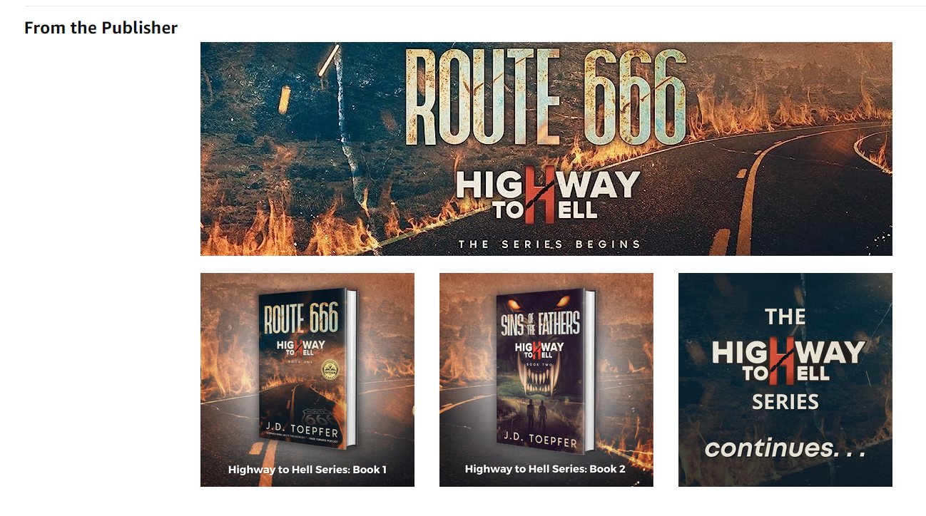
What to notice:
- The banner is the cover art. Same road, same fire, same title treatment. Nothing new had to be designed. Most covers have a background you can stretch into a banner.
- Very few words. "The series begins." That's it. It reads at any size.
- It sells the series, not just the book. Book one, book two, and a panel that says there's more coming. A reader who likes book one knows there's somewhere to go next.
- It looks like it came from a publisher. That's the whole point of the section.
One more trick I use a lot: take the cover's background art and cut it into three tall, skinny panels, with a short line on each. If your cover has a big face on it, that one's harder, because the face gets sliced up. Use a background or a scene instead.
The layout I recommend for fiction
After a lot of these, here's the stack I keep coming back to: one or three banners, plus a row of squares with your editorial reviews. One banner looks clean. Three banners tell a little story. Two always feels awkward, like something's missing. You get five modules at most, and you rarely need all of them.
Example layout · made-up series
The stack that works
The Saltglass Wars
One ship. One storm.
One last free city.
BannerYour cover art and your best hook. Use the line your ads proved.
A stolen ship.
A crew of exiles.
A sea that kills.
Three imagesThree to five words each. Feelings and stakes, not plot summary.
"Salt-soaked, breathless adventure."Publication name
"Kept me up long past midnight."Reviewer name
"Seafaring fantasy at its best."Publication name
Editorial reviewsOne quote per square, so it's readable on a phone. Four quotes max.
The series
Tidebreaker · Stormwright · The Saltglass Queen
Series bannerReading order, so a new reader knows where to go next.
The series, titles and quotes are made up for illustration. Use real editorial sources and name them.
A few things that make the difference:
- Pick quotes that describe a feeling. "Kept me up long past midnight" beats a quote that summarizes the plot. The blurb already did the plot.
- Less is more. One of the authors I work with built theirs around a single strong quote and a single banner with her best line on it. It looked great. You don't need to fill every slot.
- Steal from your comps. Look up the A+ content on bestsellers in your genre and borrow the layout. Just don't copy the quotes from Brandon Sanderson. You probably don't have those.
- Keep it consistent across the series. Same fonts and style on every book's page, so readers feel the brand.
Write it for the phone first
This is the mistake I see most. An author designs a beautiful banner on a big monitor, full of text, and it looks great. Then it shows up in the Amazon app at a third of the size, and nobody can read it. You can't even zoom in the app.
Same banner, two screens
What survives on a phone
Too many words · desktop
Kael has lost everything to the Saltglass Empire. Now, with a stolen ship and a crew of exiles, he must cross the Drowned Sea before the tide turns, or the last free city falls.
On a phone
Kael has lost everything to the Saltglass Empire. Now, with a stolen ship and a crew of exiles, he must cross the Drowned Sea before the tide turns, or the last free city falls.
Text shrinks to about 11px
Five words · desktop
One ship.
One last free city.
On a phone
One ship.
One last free city.
Hook stays about 30px
Approximate. A 970 x 300 banner shows about 360px wide in the Amazon app, so everything shrinks to about a third.
The fix is simple. Fewer words, bigger text. Use the Mobile preview in the A+ editor before you submit, and if you have to squint, cut. Review quotes are the worst offenders. Squeeze three of them onto one banner and they turn into fine print. Give each quote its own square instead.
What gets A+ content rejected
Amazon reviews every A+ submission, and it's picky. These are the ones that trip up authors I work with:
Amazon's review
Approved vs rejected
Gets approved
- Editorial quotes, source named (4 max)
- Your other books
- Series reading order
- Cover art
- Character art
- Short taglines
- Author photo & bio
Gets rejected
- Reader reviews
- Quotes with no source
- "Buy now" · "Click here"
- Prices & sales
- Dates · "Coming soon"
- Unproven "bestseller"
- Links · emails · QR codes
- Other authors' books
From KDP's A+ content guidelines and the rejections I've seen. Read the full guidelines in your KDP dashboard before you submit.
Two that catch people out. Reader reviews aren't allowed at all, not in A+ content and not in the Editorial Reviews section either. And a quote needs a real, named source. I had an author put "One of the best books I've read all year" on a banner with nobody's name on it. Ideally, someone actually said it about your book.
Also: describe your images honestly in the image keyword field. It protects your account.
A+ content image sizes
You only need two or three modules for fiction. These are the ones I use:
| Module | Image size | Use it for |
|---|---|---|
| Standard Image & Dark Text Overlay | 970 x 300 (1940 x 600 for sharper) | Banners. Leave the text box empty and put the words in the image. |
| Standard Three Images & Text | 300 x 300 minimum, 600 x 600 recommended | Taglines, books in the series, and editorial review squares. |
| Standard Comparison Chart | 150 x 300 per book | A series with four or more books. It pulls in covers and ratings. |
Keep each image under 2 MB. KDP's limits vary by module, and smaller is safer. The A+ editor shows the expected size next to every image slot, so check there if anything changes. Full specs: KDP's A+ module guide.
How to set it up in KDP
You don't need design skills. This is one of the few places in book marketing where doing it yourself really does save money.
- Browse your genre. Look at A+ content on books like yours and pick a layout to copy.
- Build it in Canva. The free plan is enough. Set a custom size for each module, and pull in your cover art and the image that won your ad test.
- Download each image and check the file size. Compress anything that's too big (compresspng.com is free).
- Open the A+ Content Manager. In KDP, go to your Bookshelf, then the "…" next to your ebook, then Promote and Advertise, then A+ Content. Choose your marketplace and click Manage A+ Content.
- Add your modules and upload your images. Leave the text boxes blank if the images already say it.
- Apply your ASINs. Add every format: ebook, paperback, hardcover. One A+ project can cover all of them. Your Kindle ASIN starts with B0 and is in your book's Amazon URL.
- Preview on mobile, then submit. Amazon says review can take up to about a week. In practice it's often a day or two, and I've seen one approved in ten minutes.
After it's live, check every version of your page. One author I work with had the editorial review module show up on one ebook page and not the other two, and had to chase Amazon support to fix it.
If you'd rather hand it off, a lot of cover designers do A+ content. Ask yours. The authors I work with are usually quoted around $100 for a simple set built from the cover. For my done-for-you clients, it's part of the Amazon page work I do before the ad spend goes up.
And if you sell a lot outside the US, A+ content is set up per marketplace. Start with Amazon.com, then check the marketplace menu for the UK and anywhere else your readers are.
Worth reading next: how to write a book blurb, since that's the bigger lever, and Facebook ads for books, for how we find the image and hook that end up in your A+ content.
Frequently asked questions
Is A+ content free on KDP?
Yes. Every KDP author can add A+ content at no cost. You find it in KDP under Marketing, or from your Bookshelf through Promote and Advertise.
Do I need Amazon Brand Registry for A+ content?
No. Brand Registry is for Seller Central sellers. KDP authors get A+ content through their KDP account without it.
Does A+ content increase book sales?
A little, when it's done well. Done badly, it can lower conversions. It's hard to measure, and the blurb and cover matter much more. Fix those first, then add A+ content built from what your ads tell you is working.
Can I use reader reviews in A+ content?
No. Customer and reader reviews aren't allowed. You can use up to four quotes from editorial sources or well-known public figures, with the source named.
How many A+ modules can I use?
Up to five per page. For fiction, one or three banners plus a row of editorial review squares works well. You rarely need all five.
Does A+ content show on paperbacks?
It shows on every format you apply it to. You can apply one A+ project to several ASINs, so add your ebook, paperback and hardcover. Then check each page, because modules sometimes don't appear on every version.
How long does A+ content take to get approved?
Amazon says up to about a week. In practice it's often approved within a day or two, and sometimes within minutes. Give it a few more hours to show up on the page.
What size should A+ content images be?
Banners (Standard Image and Dark Text Overlay) are 970 x 300 pixels, and square images in the three-image module are 300 x 300 at minimum, 600 x 600 for sharper results. Keep each file under 2 MB.
Get In Touch
Want a second
look at your
Amazon page?
Send me your book's link and tell me what you're working on: genre, how many books, and whether you're running ads. I'll tell you what I'd fix first, and whether A+ content is worth it yet.
I typically respond within one business day.
Or email directly
[email protected]